Mapping and Analysing GCSE Performance Data
The Department of Education (DoE) regularly release data on pupil performance for schools across the country. Not only can you use this resource to drill down to school level performance when researching where to send a child to school, these data can also be aggregated to provide regional insights of attainment.
When the 2015 GCSE provisional results were released at the end of last year, the BBC ran an interesting story on an apparent north-south divide in the results where schools in the South outperformed the North on average. This analysis was carried out by SchoolDash, a website that collates the DoE data and provides a user interface for parents. We were interested in looking at the data to investigate this difference ourselves.
The map that was produced in the BBC article provided a high level illustration of the GCSE results (specifically the percentage of pupils that obtained 5 GCSEs at A*-C including English and Maths), breaking England down into 9 regions. Looking at the data from the Department of Education, we found that these could be aggregated to a finer spatial level, which we have mapped below in Figure 1. The map on the left represents the results broken down into 45 regions and the map on the right represents the 152 Local Education Authorities (LEAs) in England.
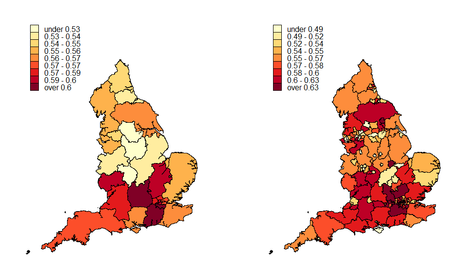
Figure 1: The percentage of pupils that gain 5 or more A*-C GCSEs (including English and Maths) by region (left-hand map) and LEA (right-hand map).
The lower resolution map on the left illustrates the north-south divide discussed in the news article (SchoolDash states that this divide broadly splits the country based on a line roughly drawn between the Severn estuary and the Wash). Even at this low resolution there are clearly regional differences, but these are much more apparent when we plot the results at an LEA level in the right-hand map. In this map we can clearly see that there is a ‘London’ effect where many of the LEAs in and around London are obtaining a higher percentage of pupils that gain 5 or more A*-C GCSEs (including English and Maths). We can also see that Norfolk is bucking the overall trend of higher attainment levels in the South.
Looking at those LEAs defined as the North, there is clearly a lot of variability with some LEAs doing particularly well compared to others. One interesting observation is that whilst there is a ‘city effect’ throughout the country, in general, the effect is the opposite of that seen in London (i.e. obtaining lower levels of attainment compared with other LEAs). Cities such as Bristol, Nottingham, Leicester and Southampton (to name a few) can all be identified on the LEA map as those LEAs that are small in geographic area and have a lower attainment results (yellow in the legend).
Note that we have plotted the maps in Figure 1 on different colour scales. In both these maps we have binned the data so that an equal number of data points occur in each colour in the legend. If we had used the same scale across both maps then some of the features in the regional map on the left would have been less pronounced. This is because there is smaller variability in the results when we are dealing with 45 regions compared to 152 LEAs. Working out what colour scale to use and how to bin the values appropriately is just one of the many choices we have to make when analysing spatial data (and whilst there is no correct answer rather we would advise looking at different options and choosing the maps which illustrate the data most clearly).
In the original article, the difference in GCSE attainment was calculated between the South and the North and found to be 4.7 percentage points for the provisional results in 2015 (i.e. on average 4.7% the percentage of pupils in the South that obtained 5 or more GCSEs at A*-C including English and Maths was 4.7 percentage points higher than in the North). This is very similar to the difference in the 2014 results, but in the previous two years it was 2.8 and 1.8 percentage points respectively. This suggests an increase in the north-south divide over the last few years. We’ve looked into this difference in a bit more detail, specifically whether there is statistical evidence of a difference and whether there is evidence of an underlying trend.
Whilst the data from 2012 to 2015 are the most easily available on the DoE website, we found with a little digging that we were able to extract data from 2005 to 2015. Calculating the differences between the North and the South, we found that there was consistent evidence of a difference and that this difference was statistically significant. However, is there evidence of a trend over time?
In Figure 2, we have plotted the north-south difference over time from 2005 to 2015. This plot highlights that despite there being an increase in the difference in the last 4 years, this is not a consistent trend over time. In fact it’s clear that the size of the difference has varied over time and there is no evidence that a trend exists. (Note that our numbers are slightly different from those obtained in the SchoolDash blog, because when we aggregated the data, we have used the total pupils in the school at KS4 to weight the averages).
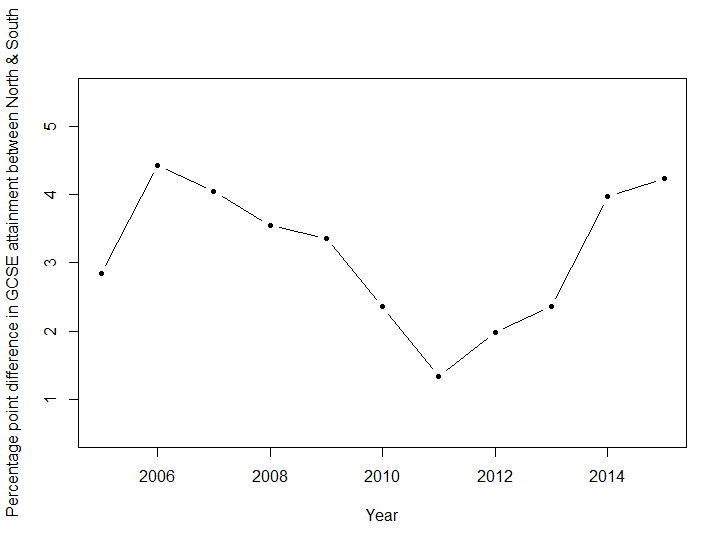
Figure 2: The difference in pupils that gain 5 or more A*-C GCSEs (including England and Maths) in the South of England compared to the North in percentage points.
An initial exploration of the DoE GCSE data raises some interesting points in how variable results are between regions in England and over time. Understanding why a north/south divide occurs in GCSE attainment not only requires a careful study of the regional data to understand regional patterns throughout England, but it is also likely that data from other sources could be used to understand potential causes. For example, the SchoolDash blog mentions that some of the differences between the North and the South may relate to the level of deprivation prevalent in the different areas.
There is evidence that the GCSE attainment in the South is higher than in the North, but we did not find evidence of a trend in this difference over the last 10 years (rather that the difference varies year on year). To understand why this difference varies over time, it is likely that we’d need to look at a finer spatial resolution; for example, is this variation driven by particular LEA’s? Condensing and mapping data across different regions, time periods and variables can be challenging, but there are different visualisation techniques available (one example is a motion chart, which is discussed in more detail in this blog). Our next challenge is to look into appropriate visualisation techniques that we can use to further summarise the DoE data and we’ll return to this subject at a later date.
Interestingly, in the same week that we wrote this blog, the Social Market Foundation (SMF) released a report on ‘Educational inequalities in England and Wales’. Similar to our and SchoolDash’s analyses, they have found large regional variations in GCSE attainment across England. Not only have they used the GCSE attainment data, but SMF have also used data on Free School Meals to illustrate how GCSE attainment and income are closely linked (those pupils who receive Free School Meals are less likely to achieve 5 A* to C GSCEs compared to those who do not). Finally, SMF also analysed ethnicity and have highlighted in their report how variable performance is across ethnic minority groups. Not only does the analysis in this report agree with the conclusions we found above, but the insights on income and ethnicity support the conclusion that regional patterns in GCSE attainment are likely to be caused by a number of different social and economic factors.