Assessing and Improving Probability Prediction Models
In a recent blog we introduced binary regression models as a method for predicting the probability of a binary outcome. Here, we examine some methods for assessing the performance of these models together with strategies for improving them. We will focus on the calibration diagram, which is a useful tool for detecting deficiencies in the model’s probability predictions, and recalibration, which can be a simple way of improving the model’s performance.
Calibration and Recalibration
The calibration of a model refers to how close its predictions are to the observed outcomes in a sample of test cases. When the outcome is a continuous variable that has been modelled using linear regression, say, then the comparison of predictions and observations is straightforward. For example, predicted values can be plotted against observed values to see how well they match and then numerical measures of performance can be constructed using the errors (i.e. observed values minus the predictions). Common performance measures include the mean squared error and the mean absolute error for example. However, when the outcome is binary the situation is more complex because the predictions are probabilities of an event occurring (i.e., a number between 0 and 1), whilst the observations are binary (e.g., “yes” or “no”) and so one cannot be subtracted from the other to obtain a meaningful difference. The binary outcome could be encoded as a numeric variable – e.g. 0 for “no” and 1 for “yes” – but, even then, a plot of observations against predictions will be largely meaningless.
To get around the problem of comparing binary outcomes with their probability predictions, we can use a method known as binning, as follows. We put the predictions into a number of bins so that all of the predictions in a given bin have similar probability values. We then compare the average predicted probability within the bin with the observed frequency of events for the corresponding observations. If the model is well calibrated (i.e. the probabilities are good predictions of what actually happened) then these two quantities should be close to each other. This can be visualised by plotting the observed frequencies against the average bin probabilities and, if the model is well calibrated, then the points on this plot should lie close to the 45 degree line through the origin.
A good way of choosing the bins is to use equally-spaced quantiles of the predictions, so that the bins each contain equal numbers of observations. For example, if there are to be 10 bins then we would use the deciles of predictions, so that the smallest 10% of predictions go into the first bin, the next 10% of predictions into the next bin, and so on. The number of bins to use is a subjective choice, striking a balance between showing sufficient detail and having plenty of observations in each bin.
To illustrate this idea, consider the example introduced in our categorical data analysis blog where we predict the probability of a student being offered a place on a post-graduate course. We start by fitting a logistic regression model in which the student’s mark on the course’s admissions exam and their academic grading from their undergraduate degree are explanatory variables. Figure 1 shows a calibration diagram for this model using seven bins. We see that the points are curved away from the 45 degree line, indicating some degree of miscalibration. For example, the rightmost point is below the 45 degree line, which means that in this bin the event occurs less frequently than predicted i.e., the average probability for the bin is 0.49 while the observed frequency is 0.43. On the other hand, several of the points in the middle lie above the line indicating that when the model suggests a probability of between 30% and 40%, this is likely to be an under-estimate of the true probability.
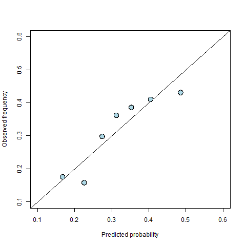
Figure 1: A calibration diagram for the student offer model.
The calibration diagram tells us that our model is miscalibrated, but what can we do about it? Miscalibration might mean that there is something missing from the model (e.g., an important explanatory variable has been left out). Alternatively, it might mean that that mathematical form of the model is a poor approximation to reality (e.g., an explanatory variable that has gone in as a linear effect in fact acts non-linearly).
However, sometimes we are limited by the data that are available, we find that non-linear transformations don’t help, and there is little we can do to improve the model itself. Fortunately though there is an alternative option for solving calibration problems: recalibration. In short, recalibration means adjusting the points on the calibration diagram so that they are closer to the 45 degree line.
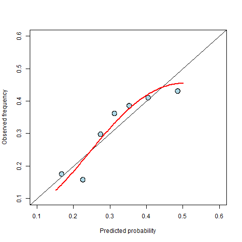
Figure 2: The fitted recalibration curve is shown in red.
In binary regression models, recalibration is usually done by fitting a new binary regression model that uses the original observations as the outcome and some transformation of the predicted probabilities as the explanatory variable. The best transformation to use is a subjective choice informed by the shape of the calibration diagram. It is generally possible to find a (often very complicated) transformation that moves the points on the calibration to lie exactly on the 45 degree line, making the calibration perfect, but such a choice would usually result in overfitting i.e., it would make the model fit very well to the data to hand at the expense of the performance of future predictions. To avoid overfitting, we follow the principle of parsimony and look for the simplest transformation that we believe adequately describes the relationship seen in the calibration diagram.
In the example above, the points in the calibration diagram follow a roughly curved path and so we might choose a quadratic transformation – one of the simplest non-linear transformations. Figure 2 shows the fitted curve on the calibration diagram. The curve is used to replace the original predictions to create new probabilities that have better calibration. For example, the curve maps an original prediction of 0.5 to a new value of 0.45. Once we have our calibrated probabilities, we can then repeat the original binning exercise with these new probabilities and produce a new calibration plot (see Figure 3) to see how well the calibrated probabilities perform.
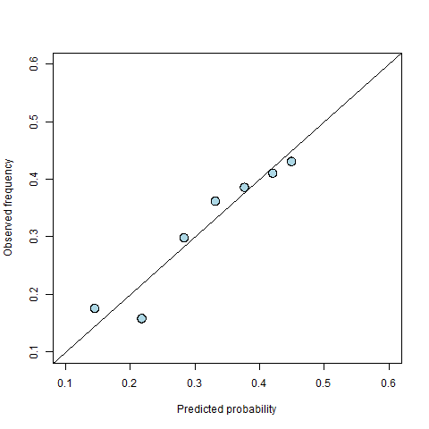
Figure 3: A new calibration diagram for the recalibrated predictions.
The recalibrated points in Figure 3 generally lie closer to the 45 degree line than those in Figure 1, but it is often useful to quantify the improvement to see how much better the calibrated predictions are relative to those produced directly from the model. A common measure for this is the weighted mean squared difference between the observations (averaged within the bins) and the probabilities (also averaged within the bins), where the weights are given by the number of data points within the corresponding bin. With this measure, a smaller value indicates better calibrated predictions. In terms of the calibration diagram, it is equivalent to the (weighted) mean squared vertical distance from the points on the diagram to the 45 degree line. This is illustrated in Figure 4, in which the red lines show the distances that would be squared and averaged to calculate the calibration. In the example above, recalibration reduced the calibration measure from 0.0017 to 0.0009 (i.e. a reduction of about 50%).
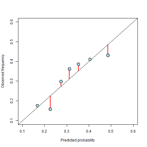
Figure 4: An illustration of the distances used to calculate the numerical measure of calibration. The calibration is the weighted mean squared length of the red lines, where the weights are the number of data points contributing to the points on the diagram.
Given that we can recalibrate to improve the model’s predictions, why shouldn’t we just repeat the process over and over until we get perfect predictions? This comes back to the problem of overfitting: each iteration of the recalibration process might improve the predictions specifically for the test cases, but making them perfect would likely worsen the performance of future predictions. We therefore usually follow a parsimonious approach and recalibrate just once.
It is worth noting that calibration is just one aspect of model performance and it is not in itself enough to identify whether or not a set of predictions are any good. In the above example, overall 32% of applicants are admitted onto the post-graduate course. If we had a model that always predicted that the probability of admission is 0.32, then in terms of calibration it would be perfect (because we would just have one non-zero bin within which the observed frequency matches the predictions), but it would be practically useless as it would not make any distinction between students. This suggests that calibration may need to be supplemented with other measures of performance in order to get an overall picture of how good the predictions are. Examples of other measures of the performance of probability predictions include resolution and the Brier score, which we will explore in a future blog.
Recalibration or Model Improvement?
We mentioned above that, ideally, calibration problems are solved by improving the original model. Recalibration can be a good fix when data are limited, but if more or better data are available, then improving the model will often lead to better all-round performance.
In the postgraduate admissions example there is, in fact, another variable available ranking the prestige of their undergraduate institution on a scale of 1-4. When we put this into the model as an extra explanatory variable, we find that the calibration diagram improves considerably (see Figure 5) and the improvement in the calibration measure is similar to that obtained from the recalibration performed above (a reduction of about 50%). The advantage of adding the extra variable over recalibrating is that it results in a more realistic model with improved interpretability. For example, the estimated coefficient of the new variable tells us that students from a higher ranked undergraduate institution are more likely to receive an offer, and a more detailed interpretation of the model could quantify this effect. There are also statistical arguments for why we should prefer model improvement over recalibration. For example, some other measures of performance (such as the resolution) are unaffected by recalibration and can only be improved by improving the model. We will expand upon these ideas in a future blog.
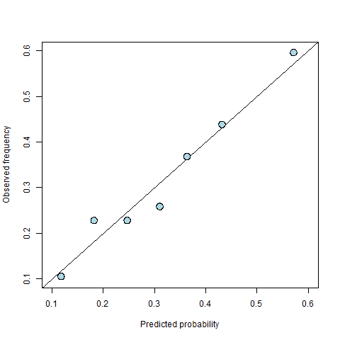
Figure 5: A calibration diagram for the improved model with an extra explanatory variable.
To sum up, calibration diagrams are a useful diagnostic tool for binary outcome regression models (e.g. logistic regression). They can be used to visualise calibration, which is an important aspect of model performance. Miscalibration indicates that something is wrong with the model, and the first step should always be to try to find the problem and fix it. However, when the data limits what can be done, recalibration is a useful tool for getting a working model that produces better calibrated predictions.
Further Reading
Calibration is just one example of a way to measure the performance of probability predictions. In a recent blog we also introduced another example: the ROC curve, which can be used to measure the classification performance of a binary regression model (i.e., its ability to successfully assign a specific outcome to each case, for example in order to make a decision). Other examples include resolution and the Brier score, which will be covered in a future blog. A whole literature exists about the many other methods for assessing prediction performance – see for example this book for a good introduction to the subject.