Using Twitter to Measure the Impact of Your Marketing Campaigns
Interacting with social media is a key element of any strategy for businesses wishing both to better understand and interact with their customers. Social media campaigns are a quick and effective way of engaging customers in a new product, service or promotional offer. But how can you measure the success of a marketing campaign on Twitter? Twitter provides a huge source of potential information and by recording tweets associated with a relevant keyword or hashtag, you can use data mining techniques to understand and evaluate user engagement. In this blog we’re going to give a simple example of the sorts of techniques you can use to analyse tweets and interpret their content.
Extracting Tweets from Twitter
Whilst it is not possible to get full access to everything that is posted on Twitter, you can get a selection of tweets via the Twitter API. In particular, it’s possible to access and store all tweets associated with a keyword, hashtag or username from the past 7 days. (There are some basic tools that are freely available that allow you to carry out historical searches over longer periods of time too, such as Apple’s Topsy and Google trends.)
Extract tweets to understand and evaluate user engagement
There are lots of different tools available to access tweets from the Twitter API, but for this blog we’ve used the statistical software R since it allows you to carry out a range of data analysis techniques from basic to advanced and provides great tools for visualisation (if you’d like to find out more about R, we’d recommend our recent blog post on R and why you should use it). We’re not going to focus on the specific commands we’ve used in R, but recommend this blog to help you get started with extracting data from the Twitter API in R and, although no longer supported, this site provides some very helpful code on how to carry out some basic analysis.
What’s Everyone Talking About?
At the simplest level, by extracting tweets based on your username, a relevant hashtag or a keyword from the tweets that you have been sending, you can calculate some very useful summary statistics. You can find out how many retweets and mentions you have received and what sort of exposure you have had (for example, how many followers do those users have who’ve been tweeting or retweeting about you). These sorts of statistics can tell you how well your campaign is doing in terms of its reach and engagement and allow you to tailor your content based on the results (for example, which tweets did well and which did not). These are the sorts of statistics that many social media platforms such as tweetdeck and Klout routinely produce.
Using R, we can not only look at basic summaries, but we can also analyse the content of tweets to understand what people are talking about in relation to your search term. To demonstrate this, we chose a search term that provided us with some interesting content and so we extracted 2,000 tweets that contained the search term ‘climate change’. We knew this would be a topical search term as we took the extract in the same week that the last of the working group reports from the Intergovernmental Panel on Climate Change (IPCC) Fifth Assessment Report was released. Using Topsy, we have plotted the time line of tweets that mention climate change in the month between 17th March and 16th April (figure 1). Not only is there a continuous stream of tweets over the month (totalling 403,133 mentions), the increase in tweets around the release of the IPCC report when we have extracted our tweets is clearly evident.
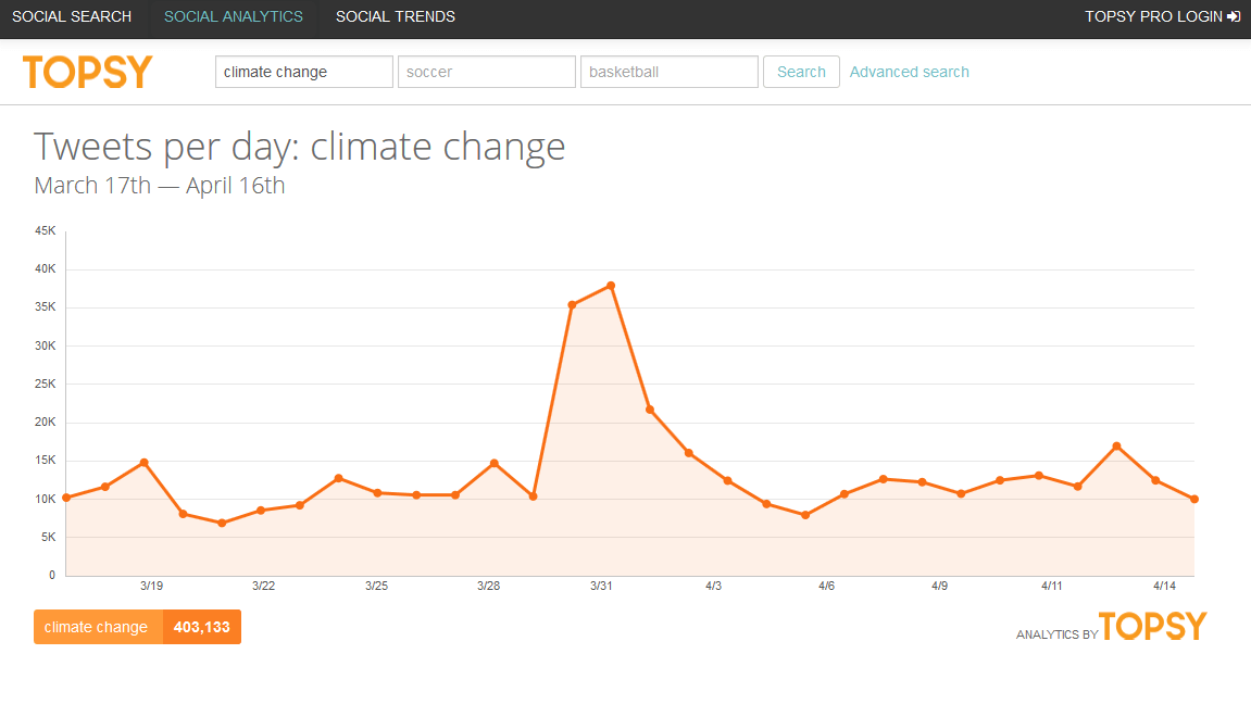
Figure 1: Timeline of tweets with the term ‘climate change’ between 17th March and 16th April 2014 generated in Topsy.
In figure 2 we’ve plotted some different graphics that can be used to summarise the content of the tweets that referred to ‘climate change’ (you can click on this figure to view an enlarged version). Firstly we’ve plotted a pie chart that provides a breakdown of the tweets to illustrate how many retweets and replies there were. This chart highlights that whilst the proportion of replies is relatively low, the number of retweets is almost as large as the number of original tweets.
To see what people are talking about, we have plotted a word cloud in which the relative size of the various words in the cloud reflects the number of mentions so that the most popular words are largest. In this case, we can see that words such as “IPCC”, “political”, and “emissions” are all mentioned with high frequency. We can also see that words that are likely to be related to the impacts of climate change are also common such as “rainforest”, “desert”, “food”, “Amazon” and “sea”. Energy is clearly another hot topic with words such as “renewables”, “fracking”, “coal” and “gas” all featuring within the word cloud.
Finally, we have carried out a sentiment analysis which categorises each tweet as positive, negative or neutral, based on the words used. Climate change is often an emotive topic and it’s interesting to see the results of the analysis summarised by the bar chart at the bottom of figure 2. Whilst you might assume that the majority of tweets would be negative, there are in fact more positive tweets, which may be due to a generally positive reception of the most recent IPCC reports. However, this could also be attributed to the common use of words such as “together”, “global”, “will” and “warming” that have positive connotations. This highlights that whilst useful, a sentiment analysis must be interpreted with care as words are treated independently and aren’t necessarily considered within the context of the other words within the tweet.
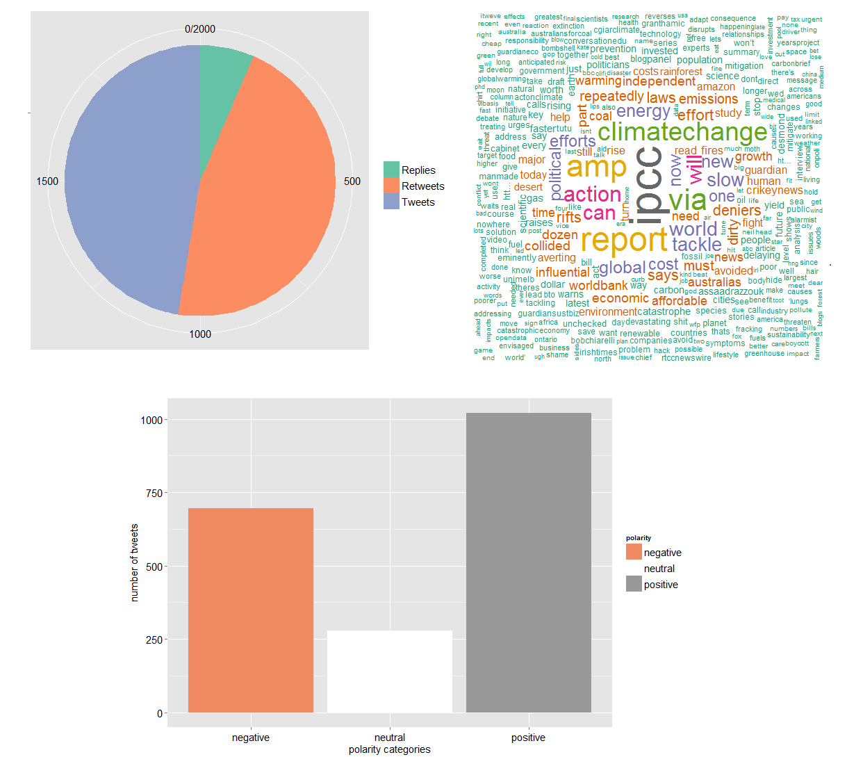
Figure 2: Graphics summarising the contents of tweets that include the term ‘climate change’.
There are of course other analyses that can be undertaken on twitter data. For example, it’s possible to examine whether there are spatial patterns to the locations of tweets since details about the latitude and longitude of each tweeter are available (unless a user has specified that they do not want their location to be made public). The timelines of tweets can also be used to identify whether users tend to tweet at a particular time of day. Understanding these patterns could help to ensure that Twitter campaigns are better scheduled and to understand, for example, how sentiment evolves or differs over time and location.
The example above highlights the sorts of techniques that can be used to analyse the content of tweets and how these can provide exceptionally useful insights if you are using Twitter as a marketing tool. They will let you understand who and how many people are talking about you, what the potential reach of your campaign is, what people are saying about you and whether it might be positive or negative. All of this information could be used to improve the effectiveness of future marketing campaigns by tailoring your content, scheduling the best time for tweets and targeting new customers through the use of relevant hashtags and keywords.
So, next time you use Twitter to post content on new products or promotional offers, remember that this is only the first step in your social media campaign. Use Twitter to its full potential and follow up any campaign by analysing the content of relevant tweets to understand the impact and reach that your campaign has had on your customer base.