Restaurant Ratings Model: Visualising the Key Findings
Clearly communicated results give our clients intellectual ownership of their analysis which should empower them to draw their own conclusions and feel comfortable explaining the findings to others. An important part of our communications are graphs and visualisations because – when they are done well – they excel at presenting a lot of information simply and intuitively. Recently, we were particularly inspired by an article in The Economist that looked at the demographic predictors of voting intention in the 2018 US congressional election. The article used one of our workhorse models, a logistic regression, and it contained a great visualisation of the results. We were keen to try to use the concept to present our own work.
We often use a logistic regression model to answer questions about the strength of factors associated with a binary outcome; for example, “What are the biggest factors associated with stroke occurrence?”. The logistic regression model can be tricky to interpret as the results are often presented as relative probabilities. For example, we might say that having a medical history of strokes increases the odds of having a stroke by 50% relative to someone who doesn’t have a medical history of strokes. The clever part about this visualisation is that we see the results as absolute probabilities – for example that the probability of having a stroke for those with a medical history of strokes is 40%. This probability statement is less convoluted and can be derived from exactly the same model.
To test the concept’s suitability to questions outside of political science, we found some open source data about restaurants – their characteristics and customer ratings – and we started by asking the question: “What are the biggest factors associated with restaurant ratings?”. We used a logistic regression model to predict the probability that a restaurant will receive a positive rating in a customer review. The model estimates how the expected probability of receiving a positive rating is related to restaurant characteristics. For example, are restaurants that have on-site parking rated more highly on average? Do we expect restaurants in different locations to attract different ratings?
Here is our version of The Economist’s graph:
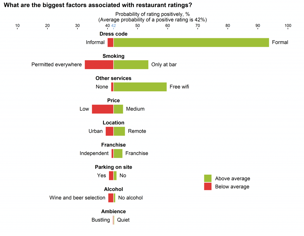
It turned out that, on average, a restaurant had a 42% chance of receiving a positive rating. The graph is centred on 42% and the bars show the differences from the average; the longer the bar, the bigger the deviation. The bars indicate the estimated probability of a positive rating for a restaurant within a group of restaurants which all have the feature labelled at the end of the bar, but otherwise have the average characteristics of the sample. So, for example, the average restaurant within a group of restaurants which have formal dress codes, but otherwise reflect the sample distribution of characteristics, is predicted to have a 93% chance of receiving a positive customer rating. Whereas the average restaurant within a group of restaurants which have permissive smoking policies, but have all other characteristics at the average rates, is predicted to have a 32% chance of receiving a positive customer rating.
The graph works so well because the green and red bars allow viewers to quickly assess which restaurant features are important. We can see that dress code, smoking policy, and the availability of other services are clearly important factors associated with restaurant rating, but parking, alcohol selection, and ambience are clearly not. We can also compare across attributes. For example, a formal dress code is associated with a probability of a positive rating about 40 percentage points higher than the probability associated with smoking confined to the bar area.
The tools available for us to create flexible, eye-catching graphics have never been better. We can create graphs such as this using packages in R, our standard statistical analysis software. In fact, we have used the same software to produce this graph that the BBC use to create the visualisations that accompany their stories (called ggplot2). Of course, the statistical details are an integral part of any analysis and should be considered when interpreting the results; but as a gateway to the key findings, striking visualisations are very useful for us and our clients.