Cumulative Gains and Lift Curves: Measuring the Performance of a Marketing Campaign
Suppose that you are running a direct marketing campaign, where you are trying to target members of your customer base with an offer in the hope that they will respond and purchase a new product or subscribe to an additional service. Using historical data from a previous campaign, a predictive model enables us to predict the probability of each customer responding based upon their characteristics and behaviours. (See for example our previous blog post on how a logistic regression model can be a useful tool for predicting the probability of a binary outcome.)
What returns will I get from running my marketing campaign?
In this context, we want to understand what benefit the predictive model can offer in predicting which customers will be responders versus non-responders in a new campaign (compared to targeting them at random). This can be achieved by examining the cumulative gains and lift associated with the model, comparing its performance in targeting responders with how successful we would be without the added value offered by the model. We can also use the same information to help decide how many pieces of direct mail to send, balancing the marketing costs with the expected returns from the resulting sales. There is a cost associated with each customer that you mail and therefore you want to maximise the number of respondents that you acquire for the number of mailings you send.
In this blog, we describe the steps required to calculate the cumulative gains and lift associated with a predictive classification model.
Decile Groups
Continuing with the direct marketing example, using the fitted model we can compare the observed outcomes from the historical marketing campaign, i.e., who responded and who did not, with the predicted probabilities of responding for each customer contacted in that campaign. (Note that, in practice, we would fit the model to a subset of our data and use this model to predict the probability of responding for each customer in a “hold-out” sample to get a more accurate assessment of how the model would perform for new customers.)
We first sort the customers by their predicted probabilities, in decreasing order from highest (closest to one) to lowest (closest to zero). Splitting the customers into equally sized segments, we create groups containing the same numbers of customers, for example, 10 decile groups each containing 10% of the customer base. So, those customers who we predict are most likely to respond are in decile group 1, the next most likely in decile group 2, and so on. Examining each of the decile groups, we can produce a decile summary, as shown in Table 1, summarising the numbers and proportions of customers and responders in each decile.
The historical data may show that overall, and therefore when mailing the customer base at random, approximately 5% of customers respond (506 out of 10,000 customers). So, if you mail 1,000 customers you expect to see around 50 responders. But, if we look at the response rates achieved in each of the decile groups in Table 1, we see that the top groups have a higher response rate than this, they are our best prospects.
| Decile Group | Predicted Probability Range | Number of Custom-ers | Cumulative No. of Customers | Cumulative % of Customers | Respond-ers | Response Rate | Cumulative No. of Respond-ers | Cumulative % of Respond-ers | Lift |
| 1 | 0.129-1.000 | 1,000 | 1,000 | 10.0% | 143 | 14.3% | 143 | 28.3% | 2.83 |
| 2 | 0.105-0.129 | 1,000 | 2,000 | 20.0% | 118 | 11.8% | 261 | 51.6% | 2.58 |
| 3 | 0.073-0.105 | 1,000 | 3,000 | 30.0% | 96 | 9.6% | 357 | 70.6% | 2.35 |
| 4 | 0.040-0.073 | 1,000 | 4,000 | 40.0% | 51 | 5.1% | 408 | 80.6% | 2.02 |
| 5 | 0.025-0.040 | 1,000 | 5,000 | 50.0% | 32 | 3.2% | 440 | 87.0% | 1.74 |
| 6 | 0.018-0.025 | 1,000 | 6,000 | 60.0% | 19 | 1.9% | 459 | 90.7% | 1.51 |
| 7 | 0.015-0.018 | 1,000 | 7,000 | 70.0% | 17 | 1.7% | 476 | 94.1% | 1.34 |
| 8 | 0.012-0.015 | 1,000 | 8,000 | 80.0% | 14 | 1.4% | 490 | 96.8% | 1.21 |
| 9 | 0.006-0.012 | 1,000 | 9,000 | 90.0% | 11 | 1.1% | 501 | 99.0% | 1.10 |
| 10 | 0.000-0.006 | 1,000 | 10,000 | 100.0% | 5 | 0.5% | 506 | 100.0% | 1.00 |
Table 1: Decile summary
For example, we find that in decile group 1 the response rate was 14.3% (there were 143 responders out of the 1,000 customers), compared with the overall response rate of 5.1%. We can also visualise the results from the decile summary in a waterfall plot, as shown in Figure 1. This illustrates that all of the customers in decile groups 1, 2 and 3 have a higher response rate using the predictive model.
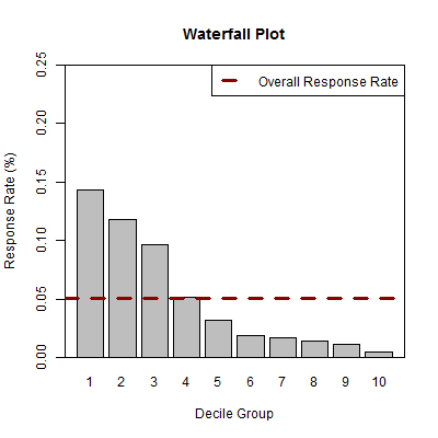 Figure 1: Waterfall plot visualising the response rates associated with each decile group, compared with the overall response rate across the entire customer base.
Cumulative Gains
From the decile summary, we can also calculate the cumulative gains provided by the model. We compare the cumulative percentage of customers who are responders with the cumulative percentage of customers contacted in the marketing campaign across the groups. This describes the ‘gain’ in targeting a given percentage of the total number of customers using the highest modelled probabilities of responding, rather than targeting them at random.
For example, the top 10% of customers with the highest predicted probabilities (decile 1), contain approximately 28.3% of the responders (143/506). So, rather than capturing 10% of the responders, we have found 28.3% of the responders having mailed only 10% of the customer base. Including a further 10% of customers (deciles 1 and 2), we find that the top 20% of customers contain approximately 51.6% of the responders. These figures can be displayed in a cumulative gains chart, as shown in Figure 2.
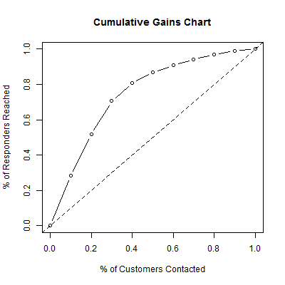 Figure 2: Cumulative Gains Chart comparing the cumulative percentage of responders reached versus the cumulative percentage of customers contacted.
The dashed line in Figure 2 corresponds with “no gain”, i.e., what we would expect to achieve by contacting customers at random. The closer the cumulative gains line is to the top-left corner of the chart, the greater the gain; the higher the proportion of the responders that are reached for the lower proportion of customers contacted.
Depending on the costs associated with sending each piece of direct mail and the expected revenue from each responder, the cumulative gains chart can be used to decide upon the optimum number of customers to contact. There will likely be a tipping point at which we have reached a sufficiently high proportion of responders, and where the costs of contacting a greater proportion of customers are too great given the diminishing returns. This will generally correspond with a flattening-off of the cumulative gains curve, where further contacts (corresponding with additional deciles) are not expected to provide many additional responders. In practice, rather than grouping customers into deciles, a larger number of groups could be examined, allowing greater flexibility in the proportion of customers we might consider contacting.
Lift
We can also look at the lift achieved by targeting increasing percentages of the customer base, ordered by decreasing probability. The lift is simply the ratio of the percentage of responders reached to the percentage of customers contacted.
So, a lift of 1 is equivalent to no gain compared with contacting customers at random. Whereas a lift of 2, for example, corresponds with there being twice the number of responders reached compared with the number you’d expect by contacting the same number of customers at random. So, we may have only contacted 40% of the customers, but we may have reached 80% of the responders in the customer base. Therefore, we have doubled the number of responders reached by targeting this group compared with mailing a random sample of customers.
These figures can be displayed in a lift curve, as shown in Figure 3. Ideally, we want the lift curve to extend as high as possible into the top-left corner of the figure, indicating that we have a large lift associated with contacting a small proportion of customers.
 Figure 3: Lift Curve showing the “lift” associated with mailing increasing percentages of the total customer base, in terms of the ratio of the percentage of respondents reached relative to the percentage of customers contacted.
In a previous blog post we discussed how ROC curves can be used in assessing how good a model is at classifying (i.e., predicting an outcome). As well as understanding the predictive accuracy of a model used for classification, it can also be helpful to understand what benefit is offered by the model compared with trying to identify an outcome without it.
Cumulative gains and lift curves are a simple and useful approach to understand what returns you are likely to get from running a marketing campaign and how many customers you should contact, based on targeting the most promising customers using a predictive model. These approaches could similarly be applied in the context of predicting which individuals will default on a personal loan in order to decide who could be offered a credit card, for example. In this case, the aim is to minimise the number of people likely to default on the loan, whilst maximising the number of credit cards offered to those who will not default. The predictive model in each case could be any appropriate statistical approach for generating a probability for a binary outcome, be that a logistic regression model, a random forest, or a neural network, for example.