Analysing Categorical Survey Data
Surveys often comprise tick-box questions where respondents are asked to select one (or potentially more) of a fixed number of possible options resulting in what are referred to statistically as categorical data. These types of questions are often preferred to open-ended free-text questions as they are generally easier to analyse and, since they are quicker to fill in, can result in higher response rates. Analysing categorical data requires the use of a specialist set of statistical tools as they are not normally amenable to the standard tools available for continuous data.
The first thing to note is that there are two types of categorical data: nominal and ordinal. With nominal data the groupings are only differentiated by their labels or names (e.g. gender or blood type), whilst with ordinal data the responses can be compared and ranked (e.g. 1st, 2nd, 3rd etc., or low, medium and high). Ordinal data are commonly collected in customer satisfaction surveys where respondents are asked to provide feedback on the service they have received based on a scale such as 1 to 5 where 1 is poor and 5 is excellent. Scales for ordinal responses vary considerably, but one common choice is the Likert scale which measures agreement or disagreement using a symmetric or balanced scale. These scales always have an odd number of categories so that the middle value can represent a neutral response (neither agree nor disagree).
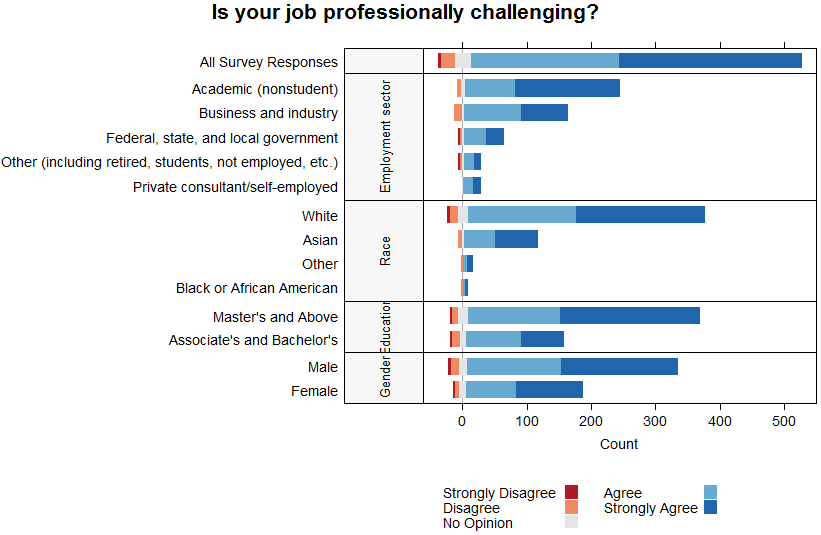
Generally, the most informative first step in analysing survey data is to plot the data to get an overall feel for the results. When dealing with ordinal data on a Likert scale one of the most effective plots for this is a diverging stacked bar chart (see this blog post for a nice description on why these plots are so effective). The example given below summarises the responses from a survey carried out by the American Statistical Association (AMSTAT) where they asked their members if they agreed with the statement that their primary job was professionally challenging. As well as summarizing the total responses, this plot also breaks down the responses by relevant demographics (such as employment sector and gender).
The advantages of this plot are that not only does it summarise all of the information in one figure, but we can quickly assess the level of consensus or agreement between the respondents. This latter point is achieved by centring the graph on the neutral category (‘No Opinion’), so that the length of the bar to the right of neutral compared to left indicates the strength of agreement (in this case most respondents agree in general on each question). This plot is easily produced in R using the plot.likert function (see our recent blog post for more information about R).
 Although this plot has been developed specifically for data on a Likert scale, we would also recommend the use of a stacked bar chart to visualise other types of ordinal and nominal data. In this case, the only difference would be that the bar chart was not centred on any particular category.
Categorical data can also be summarised using a contingency table. The example table below categorises the responses to the question by education (both counts and row percentages are given). These can be summarised further using point estimates and ranges, but we need to be careful in our choice of summary statistics. Since the data are not continuous, it’s not appropriate to use the mean and standard deviation to summarise the distribution, but we can use the median or mode together with the interquartile range instead. For example, the modal (or most likely) response was Agree for those with a Bachelor’s degree and Strongly Agree for those with a Master’s degree or higher.
| Strongly Disagree | Disagree | No Opinion | Agree | Strongly Agree | |
| Bachelor’s | 2 (1.1%) | 12 (6.9%) | 10 (5.7%) | 86 (49.1%) | 65 (37.1%) |
| Master’s and above | 2 (0.5%) | 9 (2.3%) | 17 (4.4%) | 143 (36.9%) | 217 (55.9%) |
Contingency tables are not only a neat way of tabulating the responses, but they can also be used in a more formal analysis. For example, we can test for independence between the education of respondents and their response using a Pearson’s chi-squared test or in this case (due to the small number of respondents in the Strongly Disagree category) a Fisher’s exact test. The former relies on an approximation to the Chi-squared distribution which does not hold when the sample sizes are small, which is why in this case we use the exact test instead.
We find that there is statistically significant evidence that the responses to the question “do you find your job professionally challenging” differ depending upon the respondent’s level of education. Looking at the percentages in the contingency table above, this is not surprising as they highlight that the distribution of responses varies considerably between the two education categories.
Together, the techniques described above provide a basic toolkit to start exploring categorical data and identify whether there are any discernible relationships between the different categories. It may be that this type of exploratory data analysis is sufficient on its own, but it can be extended by introducing more sophisticated techniques (such as log-linear models) in order to get a more detailed understanding. We’ll blog about these more advanced techniques in the future, but we would certainly recommend starting with the more basic exploratory techniques described above.